Dear Manuela, thank you so much for taking the time to do this interview! We’re delighted to learn more about you, your artistic work, and especially your series Nature meets Urban, in which you bring together nature and industrial heritage in such a unique way.
Let’s dive straight into our first question: For those discovering you and your art for the first time, could you briefly introduce yourself and tell us how your artistic journey began?
I am Manuela Lohmann, a self-taught watercolour artist and urban sketcher. I come from near Hamburg and have lived in Saarland for more than 20 years. Perhaps that is precisely why I am fascinated by the apparent contrasts between closeness and openness, nature, the city and industrial heritage.
From an early age, I tried to escape the confines of my childhood through painting and drawing. Being creative gives me peace and relaxation, and I love becoming completely absorbed in the creative flow.
I paint and draw every day. When I go for walks, it is sometimes not the grand building that catches my attention but a plant by the roadside, a door in an unusual colour or a shadow on an old wall. Such seemingly insignificant details can later become the starting point for an entire painting.
You describe yourself as a “collector of moments”. What does this idea mean to you, and how does it influence the way you observe and capture places, light and fleeting details in your work?
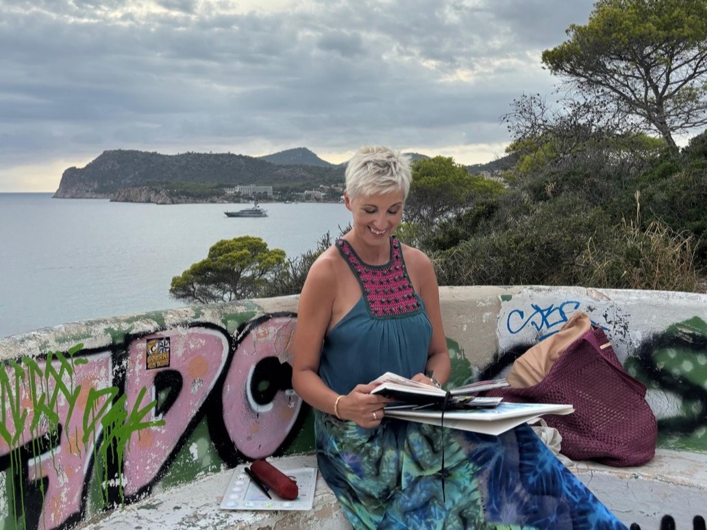
The expression “collector of moments” was coined by the writer Christian Malessa. In the summer of 2022, he spotted me on the banks of the Saar in Merzig, immersed in my sketchbook as I drew the historic towboat Anna-Leonie. Together with photographer Michel von Boch, he was working on their book “Am stillen Fluss – Begegnungen entlang der Saar” (“By the Quiet River – Encounters Along the Saar”). This chance encounter became the chapter “Die Sammlerin der Augenblicke – Manuela und die Anna-Leonie” (“The Collector of Moments – Manuela and the Anna-Leonie”) in their book.
When I read the chapter, I was surprised by how accurately the author had described the way I work. Until then, I had not realised that I really do collect moments. Today I say: I do not collect sights. I collect moments.
I am interested in more than just the obvious views. My eye is often drawn to what grows nearby, what has weathered with time, what casts a shadow or what is easily overlooked. When I look at old and new buildings, I wonder what they have experienced over the years. Doors particularly fascinate me: each has its own design, concealing rooms and stories.
For me, light and shadow heighten the tension between what is visible and what remains undiscovered or unknown. Colour brings everything to life. It can be subtle or bold, warm or cool, playful or serious. I consider it a gift to notice moments and be able to preserve them in a painting.
How would you describe your artistic approach, and which drawing and painting media do you use most often?
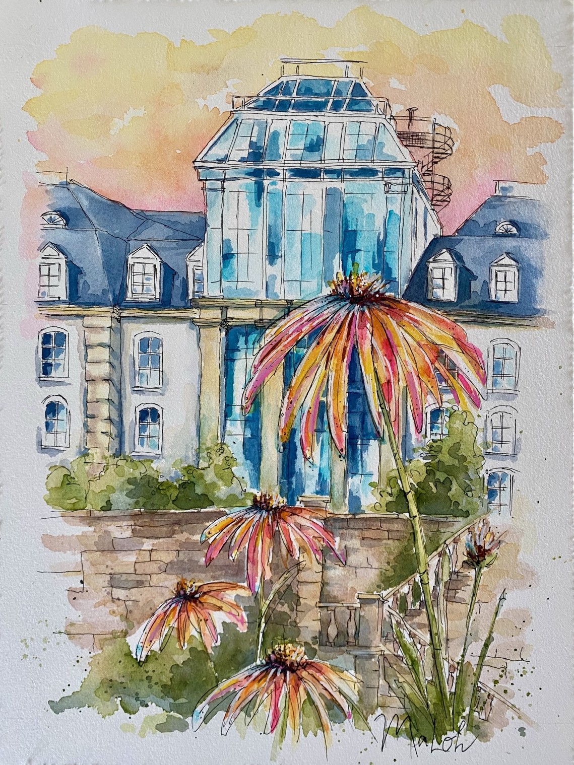
Watercolour is my primary medium. I often start with a light pencil sketch, add selected lines with waterproof ink and then introduce colour. Depending on the subject, I also use watercolour markers, artists’ watercolour pencils or occasional opaque accents with acrylic markers.
My work combines close observation with a loose, expressive watercolour style. I plan the composition carefully, but I do not want to control the watercolour completely. Water and pigment are allowed to leave traces of their own. Free-flowing washes, splashes and lively lines sit alongside deliberately refined details. For me, it is precisely this contrast that brings the work to life.
I research the history and significance of many of my subjects. My aim is not to judge, but to discover something new and see familiar places from a different perspective. My sketchbooks preserve observations, colour tests and ideas for compositions. Artists such as Felix Scheinberger, Jens Hübner, Gris and Albert Rissler have influenced the way I approach loose, narrative drawing and watercolour painting.
Could you take us through your creative process – from your first observations and colour tests in your sketchbook to developing the composition and completing the artwork?
It usually begins with an observation: a particular quality of light, a colour, a shape or a contrast. I record the subject in a sketch, photograph or note, and then research the place, building or plant. That knowledge can influence the composition without turning the painting into a documentary depiction.
In my sketchbook, I develop a small compositional study. I arrange the elements, check their proportions and distribute the light and dark areas. I pay attention to creating a clear focal point and guiding the viewer’s eye through the image. In my series “Nature meets Urban”, I deliberately alter the relative scale of the architecture and plants until the desired tension emerges.
Then I test colour harmonies and contrasts in my sketchbook and choose the right paper. The key factors are its surface, water absorption, format, weight and colour.
On the final sheet, I lightly sketch the proportions in pencil and, depending on the subject, add waterproof ink. Then I apply the watercolour. I leave what seems to be a finished painting alone for a while. With some distance, I can see more clearly whether it needs one final, carefully placed accent.
Your series Nature meets Urban combines the architecture and industrial heritage of Saarland with enlarged botanical elements. What inspired this combination, and what fascinates you about bringing nature and urban structures together?
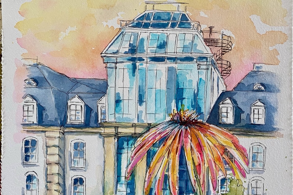
In Saarland, nature, architecture and industrial heritage exist in close proximity. Mining structures, old workshops, historic façades and modern glass surfaces meet plants growing along roadsides, on disused industrial sites or in the heart of the city. I am interested not only in beautiful views, but especially in contrasts, signs of wear and unexpected symbioses.
The plants are not merely decorative additions. I enlarge them and give them the same importance as the architecture. In my paintings, rowan berries can be just as prominent as the Saarpolygon monument; a prickly teasel can stand opposite a winding tower. What fascinates me is the moment when the familiar hierarchy shifts: the overlooked becomes large, and the monumental is given a counterpart.
When choosing plants, I consider not only their shape and colour but also their character, symbolism and location. This creates connections with the history and impact of the buildings. I do not want to romanticise familiar places, but to preserve their distinctive character while showing them from an unexpected perspective.
Sieh dir diesen Beitrag auf Instagram an
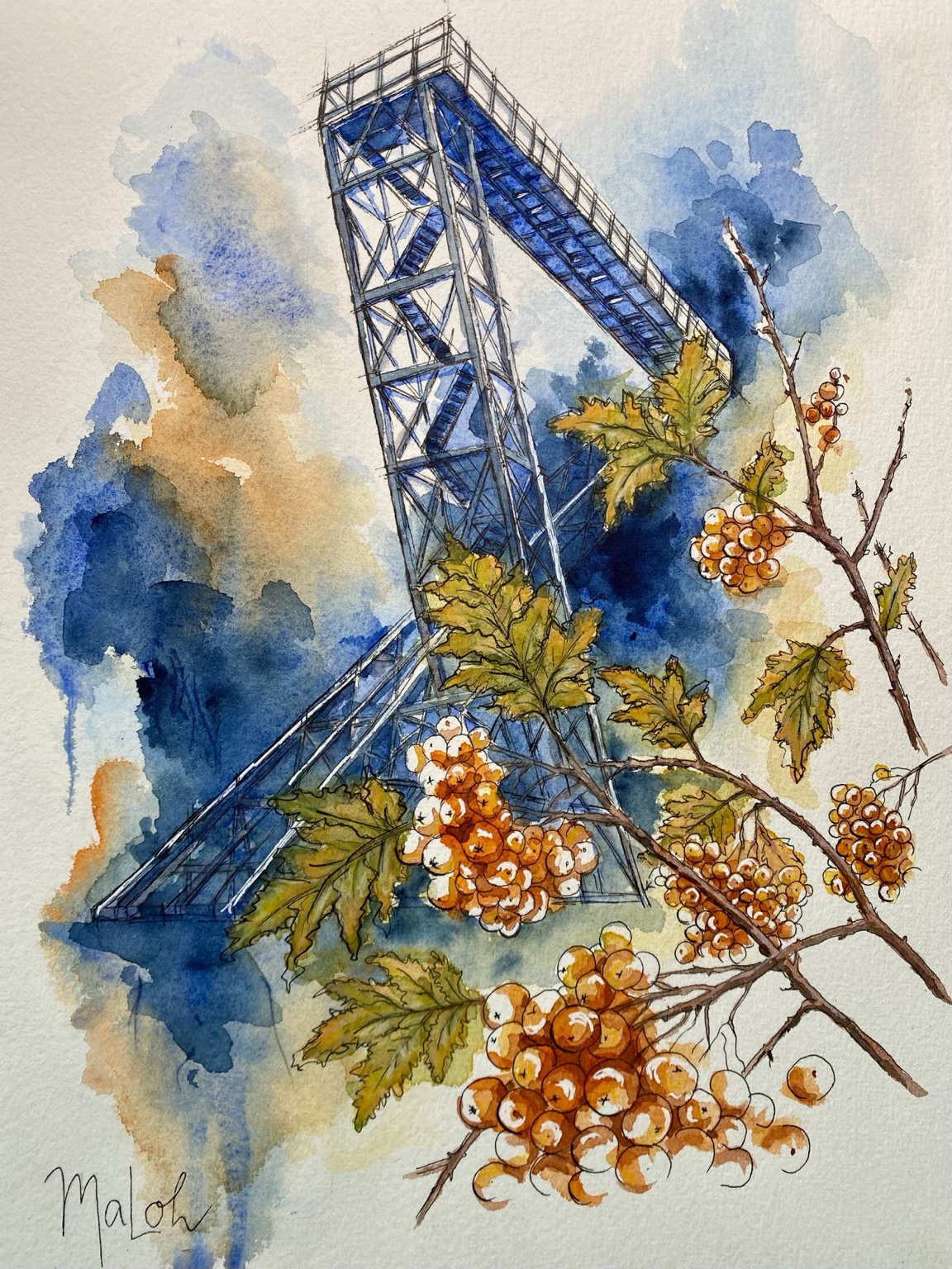
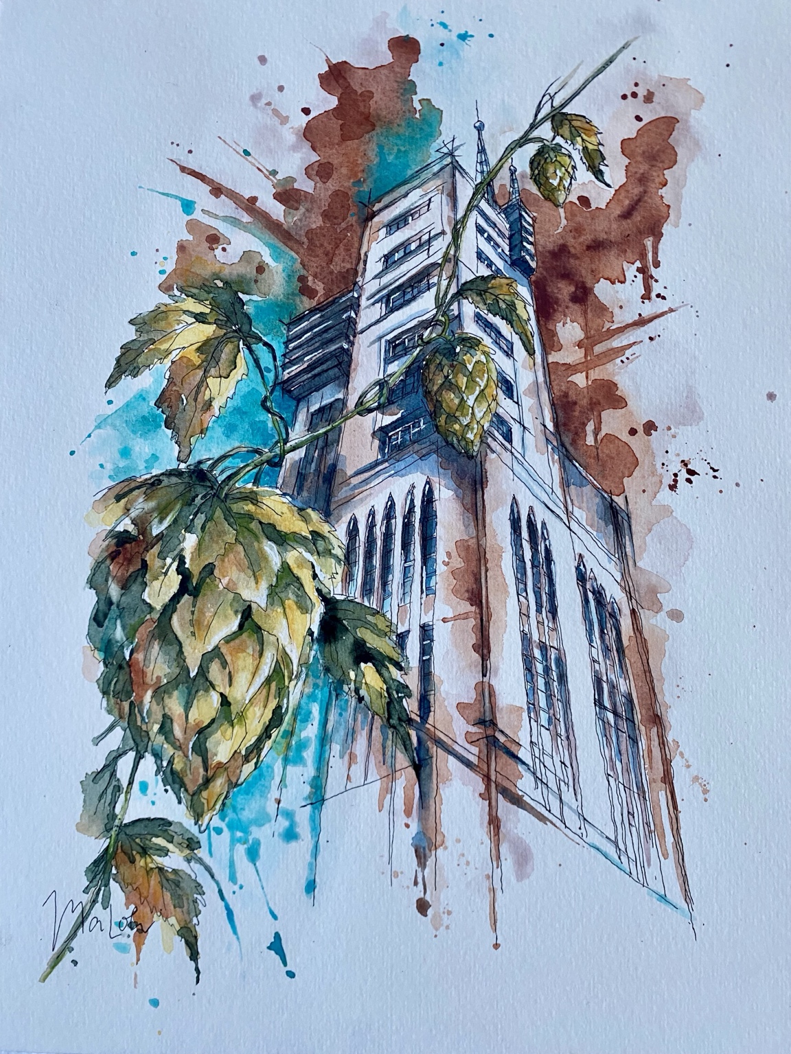
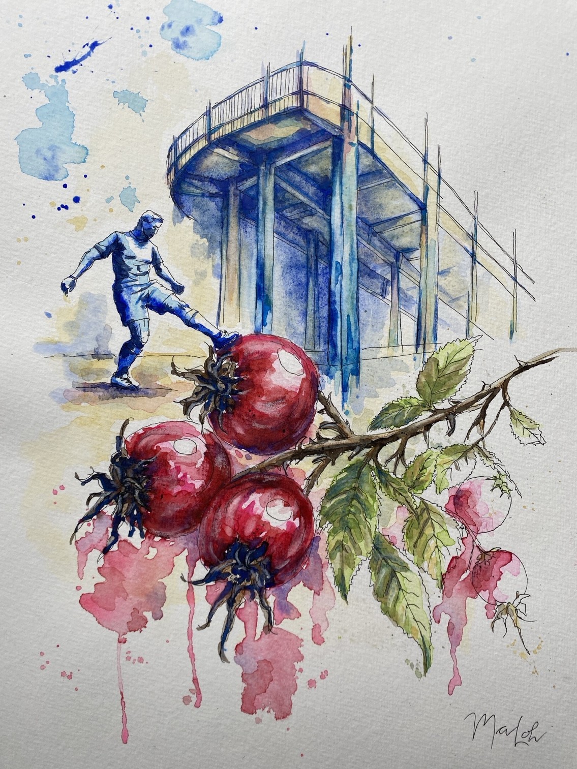
How did the idea for Nature meets Urban come about, and what would you like viewers to discover or feel when looking at the series?
Nature meets Urban grew out of two interests that have been with me for a long time: urban sketching and observing nature. On my journeys through Saarland, I encounter historic façades and industrial heritage as well as unassuming wild plants. At some point, I began not simply depicting these two worlds side by side, but bringing them into a relationship with one another.
Working on the series has also helped me get to know Saarland much more deeply. For each painting, I explore the location, its architecture and a plant that relates to it symbolically or thematically. In the process, I discover historical connections and botanical details I might once have walked straight past. With each painting, my connection to the region I now call home grows stronger.
I hope the colours and unusual contrasts will first spark curiosity and encourage people to look more closely. Perhaps they will see a familiar place in a new light or discover a plant they had previously overlooked. Best of all would be if they then began to observe their own surroundings more attentively. Perhaps developing a personal style begins when you stop searching only for a beautiful subject and start taking seriously what genuinely catches your eye.
What role does paper play in your creative process, and which properties are particularly important to you when choosing a paper?
For me, paper is not a neutral surface. It helps determine whether a colour glows or appears subdued, whether it forms a hard edge or flows softly into the next area. The surface and natural colour of the paper also shape the atmosphere of a painting. Sometimes a particular paper even inspires an idea that would never have emerged on a different surface.
Technically, I value manageable water absorption, vibrant colours and enough working time for washes and wet-on-wet techniques. I also test how easily colour can be lifted, how the paper responds to larger amounts of water and how comfortably pencil and waterproof ink glide across its surface.
Not every paper suits every technique or artistic idea. That is why I get to know how it responds to paint and water before choosing it for a project. Paper is also a valuable material. I wholeheartedly welcome and support new fibres and production methods that combine sustainability with convincing artistic performance.
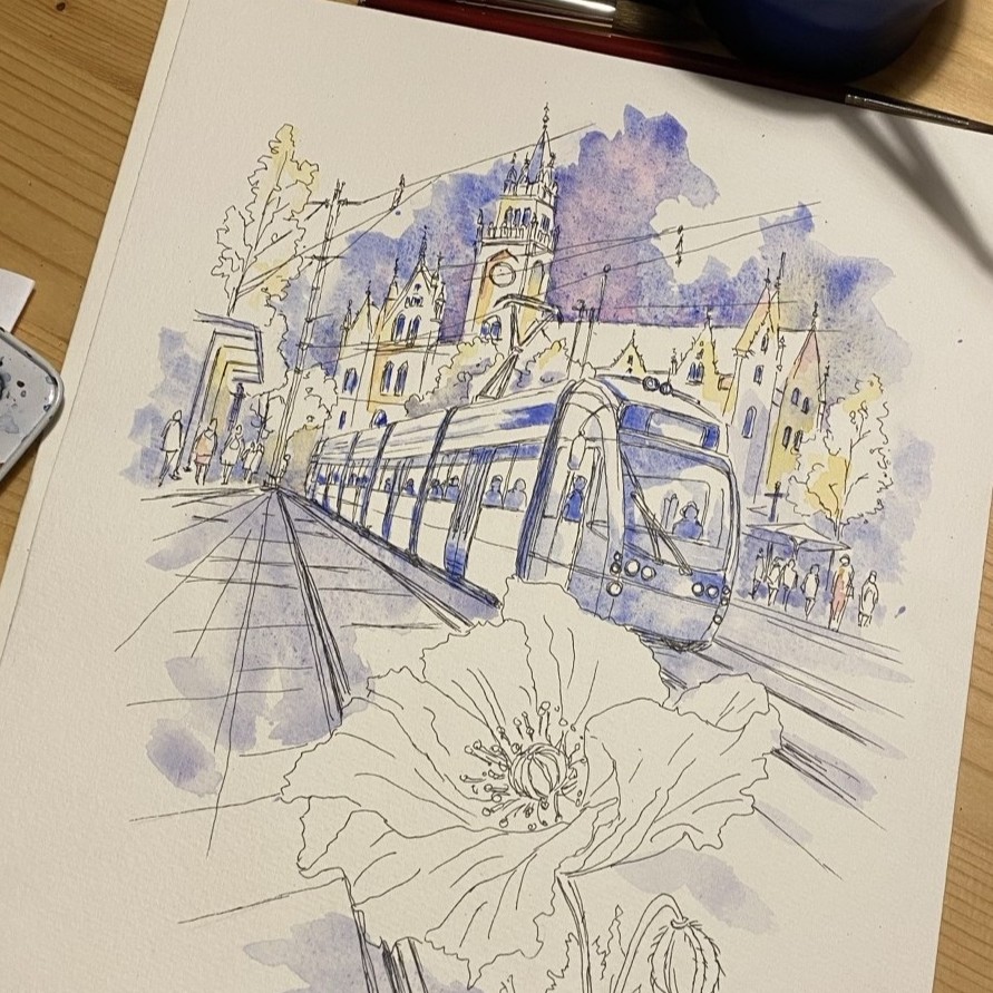
You have worked with various Hahnemühle papers, including Sugar Cane Watercolour, Agave Watercolour and Bamboo Mixed Media. How do their different surfaces and properties affect the way you use watercolour, ink and other media? Are there particular qualities you appreciate about each paper?
I have been working with Hahnemühle papers for quite some time. For the finished pieces in my Nature meets Urban series, I use Echt Bütten, 300 gsm, while I often use the 100% cotton Watercolour Book for composition studies and colour tests. I also work with Toned Watercolour in Grey and Natural, both as individual sheets and in book form, various sketchbooks, as well as Britannia, Cornwall and Bamboo Mixed Media.
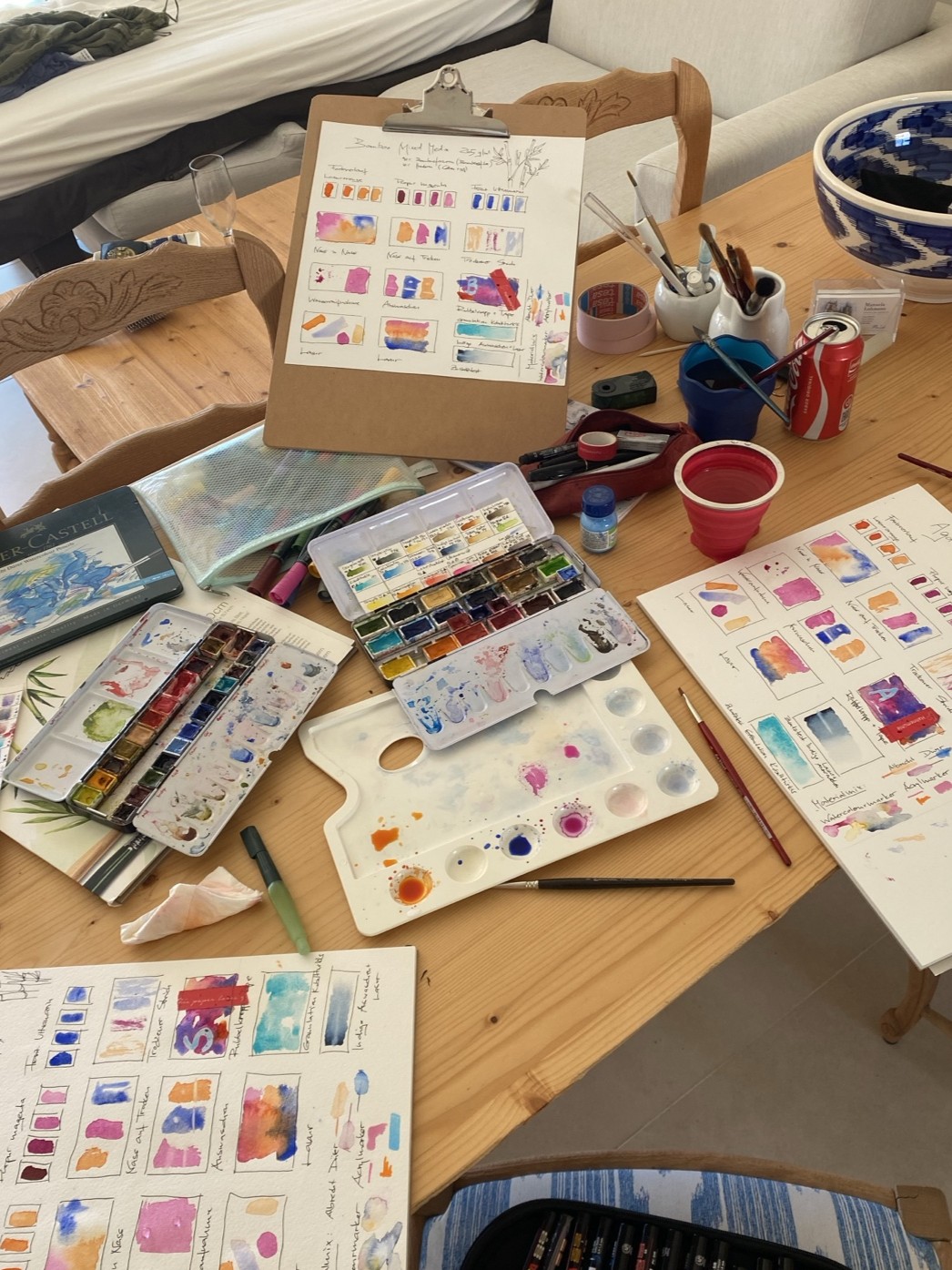
I have now compared the three papers directly using the same colours and techniques: washes, wet-on-wet painting, glazing, lifting, as well as ink, watercolour markers and watercolour pencils. My aim was not to identify one overall winner. I wanted to understand how differently the papers behave and which one best supports the way I currently work.
In my experience, Sugar Cane Watercolour requires comparatively little water and does not need to be completely pre-wetted. Colours flow particularly evenly without forming troublesome puddles. Glazing also works well without immediately reactivating the first layer of paint. Granulation appears rather fine. Waterproof ink was easy to apply; my fountain pen glided over the surface more smoothly than my fineliner. For my current loose, flowing watercolour style, Sugar Cane is therefore the best fit at the moment.
I find Bamboo Mixed Media very pleasant to use. Colours glide smoothly over the surface and can be applied softly and with control; the paper also handles larger amounts of water well. Agave Watercolour absorbs paint well, too. Pigments appear particularly strong on it, though slightly darker. Watercolour markers and Albrecht Dürer watercolour pencils look especially intense on Agave. However, its surface proved more sensitive when I removed masking tape.
Are there any new ideas, artworks or projects you are currently working on that you would like to share?
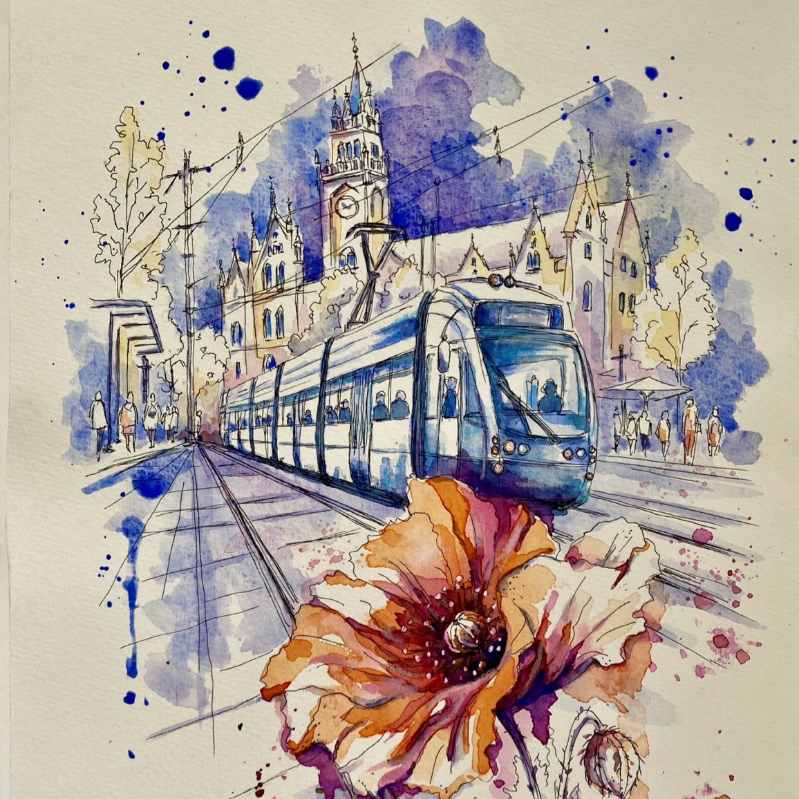
I am currently continuing Nature meets Urban Saarland. Several new works have already been created, including Ellenfeld Stadium with rose hips, Beckerturm with hops, and Linienwechsel featuring a Saarbahn tram and poppies. All three were painted on Sugar Cane Watercolour. In this way, the paper test also became a practical exploration within my series.
Another idea I would like to revisit is a small series about medicinal plants. The plan is to create loose watercolours accompanied by small glass vessels containing dried parts of each depicted plant. What interests me most is the connection between image, material and botanical knowledge.
Looking ahead, I want to keep developing my artistic voice, continue exploring Saarland and make my work visible beyond the region. Above all, I want to remain curious: about places, plants, new perspectives, different ways of seeing and the moments that cannot be planned.
Thank you so much, Manuela, for this inspiring glimpse into your creative world! Your unique way of bringing nature and architecture together, while drawing attention to the small, often overlooked details, inspires us to see the world around us with fresh eyes.
We can’t wait to see which moments you’ll capture next in your watercolours, and we wish you continued joy and success with your creative projects!