How a Fine-Art Print Studio Chooses Its Papers: A Conversation with Dev, Founder of The Print Loft
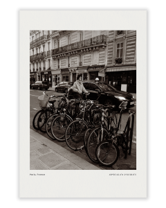
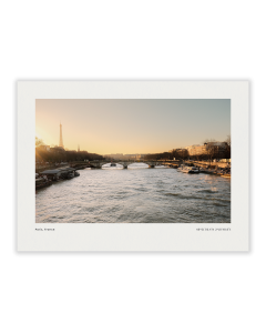
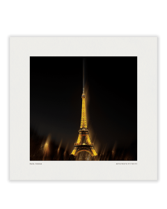
Which paper truly does justice to an image? We put that question to Dev, CEO and founder of The Print Loft, a fine-art print studio working between India and Paris. The studio’s first two collections could hardly be more different: Ground Notes, paintings by Abstractions By Dev inspired by Himalayan valleys, ridge lines and the particular light found at altitude, and Letters From Elsewhere, photographs by Studio Halcyon that show Paris beyond the postcard moment: wet stone, shutters, peeling paint and streets once the crowd has moved on.
Rather than settle on a single paper, Dev had the same works printed on a wide range of surfaces, laid side by side and examined closely. Three papers remained: Hahnemühle Museum Etching 350 gsm, Photo Rag® Baryta 315 gsm and Studio Enhanced 210 gsm. In our conversation, Dev explains why canvas was ruled out so early, what the blacks reveal about a paper, and why, in the end, the image should always make the decision.
Test the Work, Not the Facts
At first, I did what most people do: ordered samples, read the descriptions and formed opinions before seeing the actual work printed.
That method did not last long.
A surface can be beautiful on its own and still be wrong for an image. A textured sheet can bring character to one photograph and interrupt another. The same applies to colour. A green mixed by hand over an afternoon can return from a print test slightly changed. Worse, it can return differently changed from one supplier to the next.
But it was the blacks that settled the question.
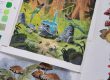
In the darker sections of a Ground Notes painting such as Dusk Over Ridge, a valley floor drops gradually into shadow. There are small tonal steps there, close together but essential to the work. On weaker tests, those distinctions compressed into a heavy dark grey. The print did not fail loudly. It simply lost its depth.
That became our test: not whether a sheet sounded premium, but whether it could carry the work without taking part in it.
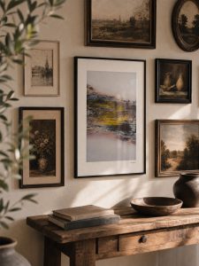
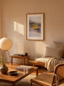
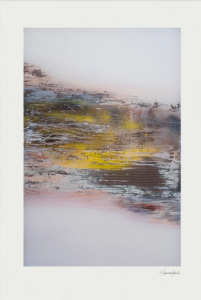
The Surprise: Not Canvas
We tested paintings and photographs across a selection of Hahnemühle papers, including warm-toned natural-fibre papers, smooth cotton papers, baryta surfaces, textured matt papers and canvas.
Canvas was the first material we ruled out, including for the paintings.
It was a useful correction to an easy assumption. A canvas print can reproduce the idea of a painting, but its weave adds a texture that was not in the original work. In some cases, it can sit on top of brush marks like a second hand in the image.
Paper was quieter. It held the colour, the tonal range and the marks already present in the work, then stepped back.
Three Papers, Three Roles
For Letters From Elsewhere, Museum Etching 350 gsm became a natural starting point. Its pronounced felt texture works with the grain already in the photographs: wet pavements, old shutters, worn facades and the imperfect surfaces that make the city feel lived in. The paper adds physical presence without turning the photograph into an effect.
For Ground Notes, Photo Rag® Baryta 315 gsm was the turning point. The smoother baryta surface preserves the gradual tonal movement in the paintings, particularly through deep shadows and low-contrast colour shifts. It gives the blacks weight while allowing fine changes in value to remain visible.
Neither choice is meant as a rule. A collector choosing a limited edition can select either Museum Etching or Photo Rag® Baryta depending on whether they are drawn to a tactile matt surface or a smoother baryta finish. But the test gave us an informed place to begin.
Our open editions are printed on Studio Enhanced 210 gsm. That is not a lesser version of the limited-edition papers; it is the right paper for a different job. Open editions are how someone buys their first serious print rather than their fifth, without stepping outside the standard. The lighter matt paper frames cleanly, handles well and gives the work the presence it needs.
Look at the Blacks
The final system is simple: limited editions of 50 are hand numbered and issued with a certificate of authenticity, printed on Museum Etching 350 gsm or Photo Rag® Baryta 315 gsm. Open editions are printed on Studio Enhanced 210 gsm. Every print is produced using pigment inks on a twelve-ink giclée printer.
The useful lesson was not to find one “best” paper. It was to print the same work on different surfaces, put them together under daylight, and let the image decide.
Discover all fine-art prints on Hahnemühle paper at www.printloft.com.